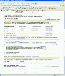
Little ALT tags (those little text pop ups you get when you roll your mouse over graphics on well designed sites) can save the day, you know. Take Amazon’s change card info page:
 Midway through the checkout process on amazon, I try to change my card to use for payment…and a big WTF. I cannot get back to checking out EXCEPT by clicking on the link for Amazon’s credit card offer. Thinking there might be a missing graphic, I refreshed. Surely there is supposed to be a button here, but there are no ALT tags, no clues, so I’m stuck.
Another case of “what next” ambiguity. Web designs, even Amazon, must make it clear how to flow through, especially in check out processes.


